
T'is the season .....deck the halls with boughs of holly fa la la la la la laaaah! You are lucky because you can't really hear me sing.
| GATHER YOUR SUPPLIES | |
|
|
* Mixing Red with Dark Green will make a shading color. Avoid using black with white to create a gray which causes harsh and muddy shading colors.
THE PLAN
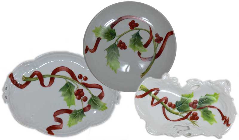
Above are three concepts for you to use or these designs could be the jumping off point towards creating your own design inspiration for a holiday painting. These paintings can be finished quickly and used for holiday gift giving.
Although the berries and leaves worked as a design alone it seemed as though these designs could use another design element. By adding a lively red meandering ribbon around the stem and through the leaves the design gained a little spark and movement.
PREPARATION
Clean the surface of your china. Remove any labels from your china that might burn off in the kiln. Glass cleaner or hand washing with dish detergent or a mixture of vinegar and water will clean your blank china.
I like to draw or print my designs on tracing paper. Use a piece of graphite paper to transfer the design onto your porcelain surface. I don’t know if carbon paper for typing multiple copies exists today, however, it isn’t recommended that you use carbon paper because it doesn’t burn off of the glazed surface in the kiln. Graphite paper does burn off of the surface of the porcelain in the kiln. Place the graphite paper, graphite side down onto the porcelain and the tracing paper on top of the back of the graphite paper. Use a stylus or knitting needle to trace around your design. The design will transfer onto the porcelain. If you would like, you can trace around the graphite lines with a Sharpie marker which aids in stabilizing the lines while you paint.Graphite marker tends to smear as you paint. This is a personal preference.
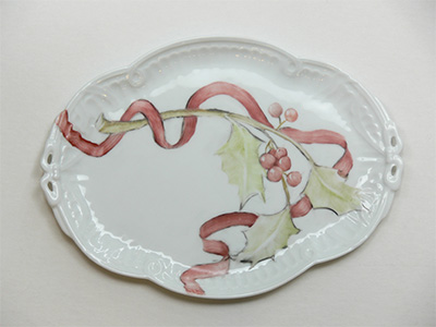
Above is example of First Fire Painting.
HAVE FUN PAINTING
Second Fire
Whichever red that you used on the first fire, you need to add more of that color to the ribbon. If you left highlights on the ribbon wipe them out again. Now in the areas where the ribbon meanders underneath leaves or the stem, use Red Violet of Iron or a blended combination of red and darkest green mixed to a grayish mixture and paint it into the area where the leaf or stem intersect which will result in an even deeper and richer shadow area. Use this mixture only in the deepest areas that you want to give the illusion of shadows and depth.
Second Fire
The goal on the second fire is to create the illusion of a round stem with a cut end. In order to accomplish the roundness, use the middle value Brown Green in the middle part of the stem and Darkest Green on the edges. Use a clean stiff brush or a wipe out tool and wipe back to the previously fired layer of Sap Green in center areas on the stem. By wiping some Brown Green back to the original Sap Green the stem begins to appear rounded. On the cut end of the stem paint brown green around the edge of the circular cut then wipe out a line around the outside to simulate green bark on the cross section of the cut. In the center of the cut stem edge place an oblong dot using a round tipped brush loaded with brown green. Keep the area around the oblong dot very light.
Lately I have been teaching leaves using the following method which seems to help new students learn to blend colors without getting a muddy appearance on the leaves. Also teaching this method helps students practice wiping out veins on the second fire.
First Fire
Apply a coat of sap green. Wipe out some reflected light along the leaves. More colors will be added on the the second fire.
Second Fire First Fire Second Fire Firing your Design A note on firing. Avoid firing reds too hot in the kiln because they will turn brown. If possible, test fire your reds before painting. My kiln seems to fire the reds used in this study at cone 015.
First Fire Second Fire
On the second fire your three main colors can be Sap green for the lightest value on the tips of the leaves, Brown Green for the middle value and Darkest Green for the darkest value on the leaves. On this study the leaves were simplified in order to make the design easier to paint. There was minimal overlapping and in most cases the leaves did not touch each other. This is a simplified graphic approach and was intended to make the design very easy for the beginner. Begin by painting the leaf Sap Green or Chartreuse on the tip of the leaf. Then load Brown Green onto your brush and paint the middle area of the leaf. Finally, load Darkest Green onto your brush and paint the lower part of the leaf. Using either a wipe out tool or a clean and oiled stiff shader brush, wipe out veins on the leaves which exposes the original coat of previously fired Sap Green which now can look like a leaf vein.
Use Blood Red or Pompadour and lightly paint the berries. Then use a wipe out tool or a stiff brush to wipe out highlights. For a consistent look, think about which direction the sun is shining on the berries then wipe out highlights accordingly.
Paint a heavier coat of Blood Red or Pompadour over the berries. Use Red Violet of Iron or a combination of red and green to make a grayish mixture and paint near the area where the berries might have shadows and where the berries are overlapping. The idea behind using this mixture is to create depth and shadow areas. Avoid covering the entire berry with this mixture as they will appear over ripe after firing and will appear flat instead of rounded. Use a small flat shader and wipe out some paint to create reflected light where the sun might hit the top of the berries. Then wipe out a highlight on the berries with a clean and oiled brush or use a wipe out tool. The final step is to use a small round brush loaded with rich brown and place a small dot on some of the holly berries.
Fire at Cone 015
Fire at Cone 015
E-mail: 💌 marylou@maryloulaberge.com